Introduction
At Sigstr, we focus on email signatures. Sigstr Campaigns allow you to unlock the powerful marketing channel of employee email. Many of my day-to-day responsibilities revolve around designing these campaigns both internally and through our Services offerings where we design campaigns for our customers. That said, I thought I’d share a few tips.
Step 1: Gather the Information
Every time I sit down to design a Sigstr campaign in the email signature template, I make sure I have all the information needed. Before I start digging in, I like to have brand assets (such as logos or brand colors), and if the campaign is promoting an event, a URL to the event’s landing page. Landing pages help provide context and guidelines to design around. Before I dive into the design, I take a step back and ask, ”’What is the main goal I want to accomplish with this graphic?” or, “What company initiative is this campaign helping promote?”
These types of questions will only help your cause as you look to create the best email signature design that fits well with your company initiatives.
Step 2: Experiment with the Brand
Next, before I start laying out the information, I begin experimenting with the brand elements. This includes the color palette (in order to help me understand which colors would work better on top of others), the font, which colors work best with the font, and the logo. Understanding how your brand’s colors work together expedites the campaign design process immensely for your email signature generator.
Step 3: Putting the Pieces Together

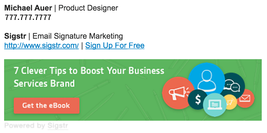
For example, I always start with the campaign’s call to action being the brand’s boldest color. Here at Sigstr, we keep a close eye on the metrics we see within the app. We’ve seen the best views to click ratio on campaigns with red call-to-action buttons.
Try including photography in your campaign. Images with overlaid brand colors at 60 – 80% opacity work really well as backgrounds (but be careful not to cause sensory overload). For the best results, combine your image with an on-brand accent color.
Sometimes with a campaign design I’ll find myself hitting a brick wall. Maybe the campaign just doesn’t look right, or maybe I’m missing some key details that need to be included. When I hit that point, I start asking coworkers what they think about the campaign. Receiving feedback is always the best for improving your campaigns.
Step 4: Next Steps?
So now you’ve got a fantastic looking campaign sitting in front of you. What do you do next? Try coming up with a second campaign design! Trust me, nine times out of ten the second campaign I end up designing is better than the first. Even if the second version isn’t better, you now have some great options to choose from.
Hopefully these tips help you with your campaign designs. Here at Sigstr, we’re all about creating the best email signatures, and the campaign design is a big part of that. We’re here to help and be your source for inspiration! If you have any additional questions about your email signature, email us at [email protected].
Also, don’t forget about our growing list of tutorial videos! These offer up some great tips and tricks and walk you through how to use certain features within Sigstr.
Ready to get started?
© 2025 Terminus Software, Inc.

