When we saw the recent business.com article entitled, Leave a Good Impression: The Best & Worst Email Signatures of All Time, you better believe that we read it (and laughed a lot). And of course, we had to share it with our readers as it also offers up some great pointers, which well share below.
Weve all seen a few doozy email signatures, and maybe weve even been guilty of of some of the no-nos: Comic Sans font, multi-color rainbow colors, inspirational quotes, links to all 10 social media accounts or distorted headshots. But as the article reminds us, Email signatures are the John Hancocks of the digital age. Often times, your email recipients will never meet you face to face (at least in the business world), so every time you send an email, you are making an impression on that person. And the email signature template is the most consistent aspect of those touch points. What kind of impression are you leaving on your email recipients?
According to the article, heres a rundown on what not to include in your email signature format, along with some tips for creating the most efficient email signature template possible.
Run the Other Way From These Email Signature Examples
Inspirational Quotes
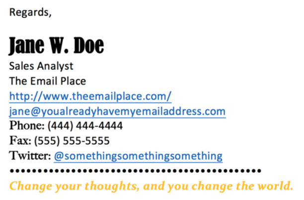
This is your professional email, not your high school yearbook, Ricardo Casas stated in the article. As such, its not the place to feature aphorisms like, Don’t judge each day by the harvest you reap but by the seeds that you plant. A worthy piece of advice, to be sure, but the person reading your email most likely doesnt care.
A Reiteration of the Senders Email Address (Often Hyperlinked)
Kevin Zawacki at Slate.com likens this to, Placing two return address stickers on an envelope. First of all, it feels like youre beating your recipient over the head with your contact information.
And, from a practical standpoint, its completely redundant. The recipient already has your email address; if they want to respond to your email they simply have to hit Reply.
Too Many Fonts
According to Ricardo, Using more than two different fonts (particularly novelty ones) in your email signature is a recipe for a design headache. It looks cluttered and unprofessional.
Additionally, if youre creating a text signature and end up using a novelty font, you cant guarantee your recipient will have that same font installed on their computer, so the result could be a jumbled mess looking nothing like the way you intended it.
Too Much Text, Period
You may be familiar with these types of text signatures, full of information stacked line by individual line, said Ricardo. First, you have the senders name. Then their title. Then their work phone number, then their extension, then their email address, then their fax number, and so on.
A slight exaggeration perhaps (mostly), but the point is this: nobody likes to scroll and scroll to find the information theyre looking for. The key is to keep it simple.
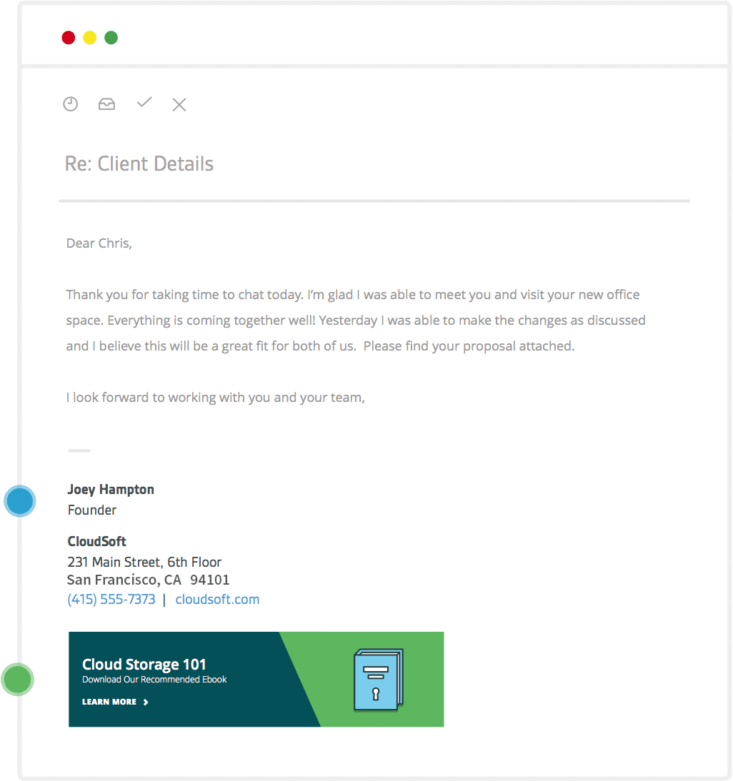
Take Hints From This Awesome Email Signature Template
Simplicity
You dont need to bombard your recipients with a plethora of information, Ricardo advises. Stay short, sweet, and to-the-point. Give them only the information that really counts.
Just the Basics
As earlier stated, its unnecessary to restate your email address in your signature. Ask yourself what information is actually crucial, and what could be omitted for the sake of clarity, said Ricardo. Your phone number is almost always important to include, along with the name of your company. Your job title is also helpful so the recipient can have a better idea of your role in the company.
You may also find it helpful to provide links to your social media platforms, but only if they are relevant and there arent a hundred of them.
Clean, Eye-Catching Graphics
Ricardo explains that if youve chosen to use a customized graphic for your email signature, make sure its not a mess of fonts and colors. Its best to eliminate distractions by using only one or two colors (and as many fonts) in your signature graphic.
Introducing Sigstr for Email Signatures

Sigstr offers marketers complete brand control of employee email signatures withfonts, formatting, color, social links and more through its integration with Gmail and Microsoft Outlook. Insert a Sigstr Campaign (graphical call-to-action) into your email signature templateto utilize every employee’s email signature as a targeted marketing opportunity. Sigstr gives marketers the opportunity to promote the companys most important initiatives or content, such as events, press, case studies, ebooks, job openings and much more.
With Sigstr, marketers can be sure that every employee email signature formatis on brand and updated across the entire company with just a few clicks. Sign up for Sigstr and start your free 30-day trial today to begin experiencing the power of professional email signatures.


