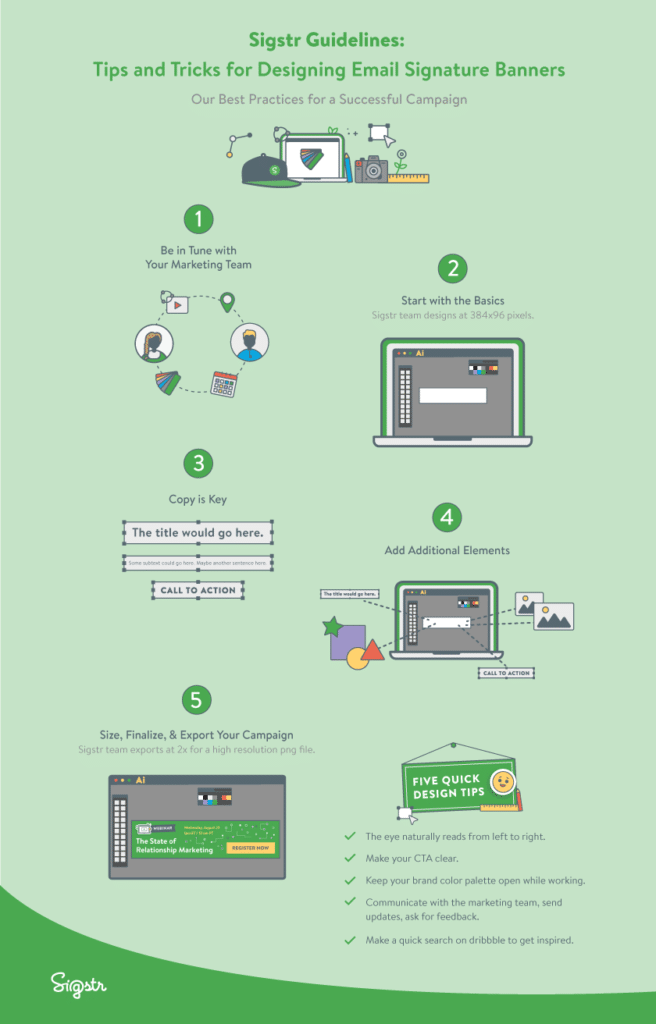
Here at Sigstr, we often get asked about our own bold, eye-catching campaign designs. Our bright colors, unique sticker-style illustrations, and cohesive branding have helped us “drink our own champagne” by achieving great engagement with our email signature marketing banners. Our designer extraordinaire, Anna Zimmerman, sat down to share a few secrets and tips on how she approaches designing campaigns. Her five-step approach is summarized in the infographic below.
Be in Tune with Your Marketing Team
Every piece of content I create starts with an idea or request from our Marketing team. I work closely with them to understand their needs and feedback as I design, and we collaborate on creating content to promote our most important initiatives – whether that’s a webinar, internal event, blog post, content piece, etc. Being in tune with their needs allows me to deliver high quality designs that will serve their intended purpose.
Start with the Basics
When I’m sitting down to create an email signature banner, I start with a blank art board and have our Sigstr company color swatches open. Having clear Sigstr brand guidelines makes my job that much easier. With our Sigstr colors available as a base, I start to look for ideas depending on the content of the campaign. I use a website called dribbble – a community of designers sharing their work – and search for keywords based on the content of the campaign. Sigstr’s Marketing team usually supplies me a few bullets, key words, or a quick summary sentence of what the campaign should convey. I also search Google Images to look for a spark of inspiration or to learn more about how to visually convey the content of the campaign. Icons, color combinations, and shapes give me ideas on how to create a stand-out banner.
Copy is Key
Clear messaging and purpose is essential for an email signature design. A strong headline is key, and as a rule of thumb I try to not go over 8 – 12 words. Any additional context can be placed in the subtext, but I try to keep that as concise as possible. I always have the copy as well as the call-to-action typed out beside my art board to guide my work.
Add Additional Elements
I almost always use an illustration or image to help draw attention to the campaign. Our State of Email Signature Marketing Report confirms that icons and illustrations are popular in helping drive engagement, and our fun icons and sticker-style illustrations have definitely become a key part of our own branding. I bring in the illustration or image as well as the text and place those elements inside the campaign, keeping in mind that the eye naturally reads left to right. The CTA usually goes on the far left side or bottom of the campaign layout, to keep in line with that natural movement.
Size, Finalize, & Export Your Campaign
We’ve experimented in the past with a few different campaign sizes and shapes (and our customers use a variety), but, as our Science of Email Signatures ebook proves, short and wide is the most effective shape. We design campaign banners to fit into a 384×96 container (with the original design exported as a 768×192 .png file since it will be uploaded as a hi-res image). I make sure to fit all content in the dimensions of my art board, keeping the design elements consistent and creating a cohesive, eye-catching banner to help drive engagement.
Infographic: Best Practices for a Successful Campaign
The Sigstr team is always here as a resource for ideas, inspiration, and examples. Just reach out to [email protected] – we’re happy to help however we can. And be sure to read our new September Issue of Email Signature Marketing for even more ideas and inspiration from our most creative customers. Finally, we put together this infographic to summarize the five steps above. Feel free to use this as a guide when designing your next email signature banner, and check out my five quick tips at the bottom!
