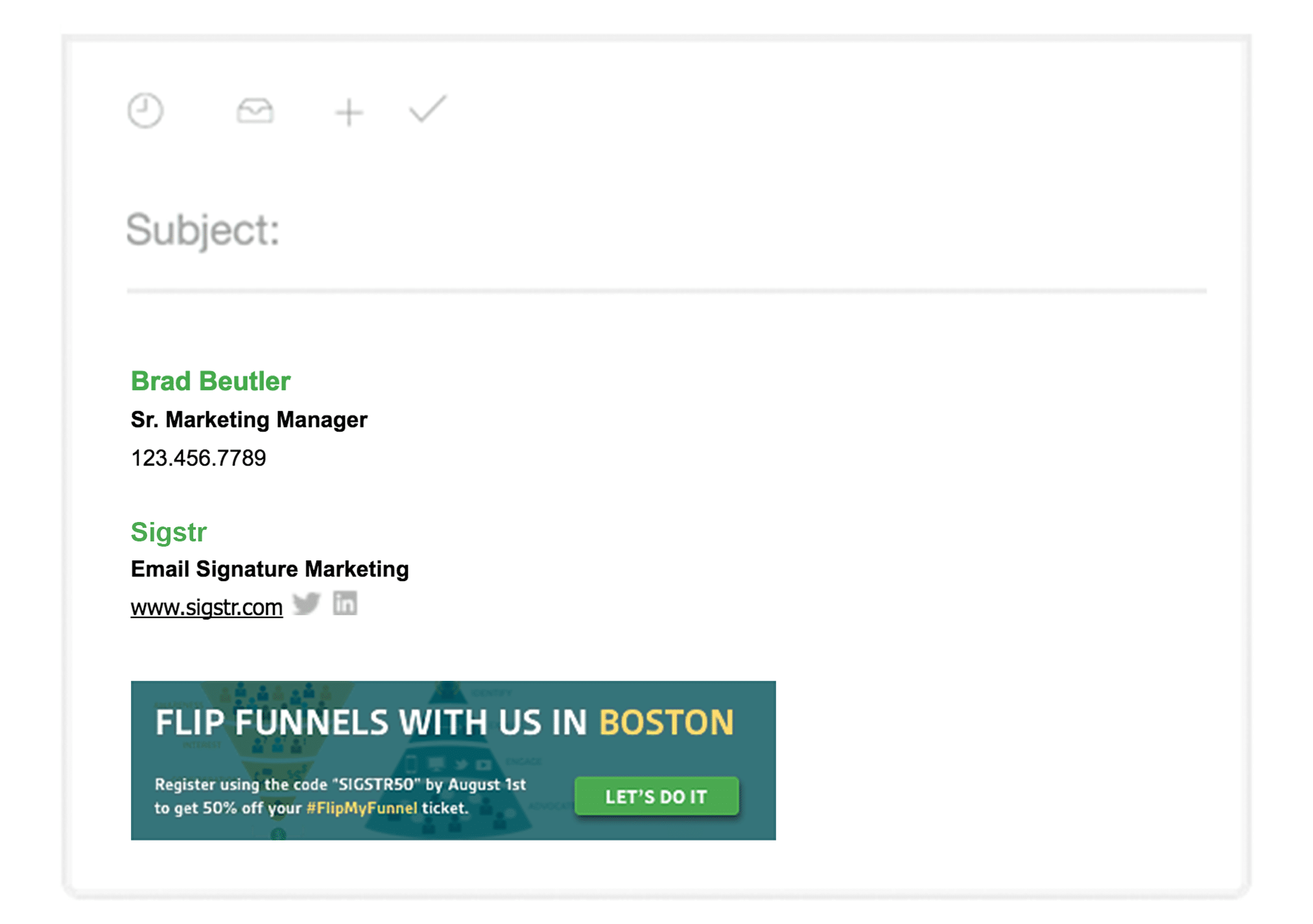
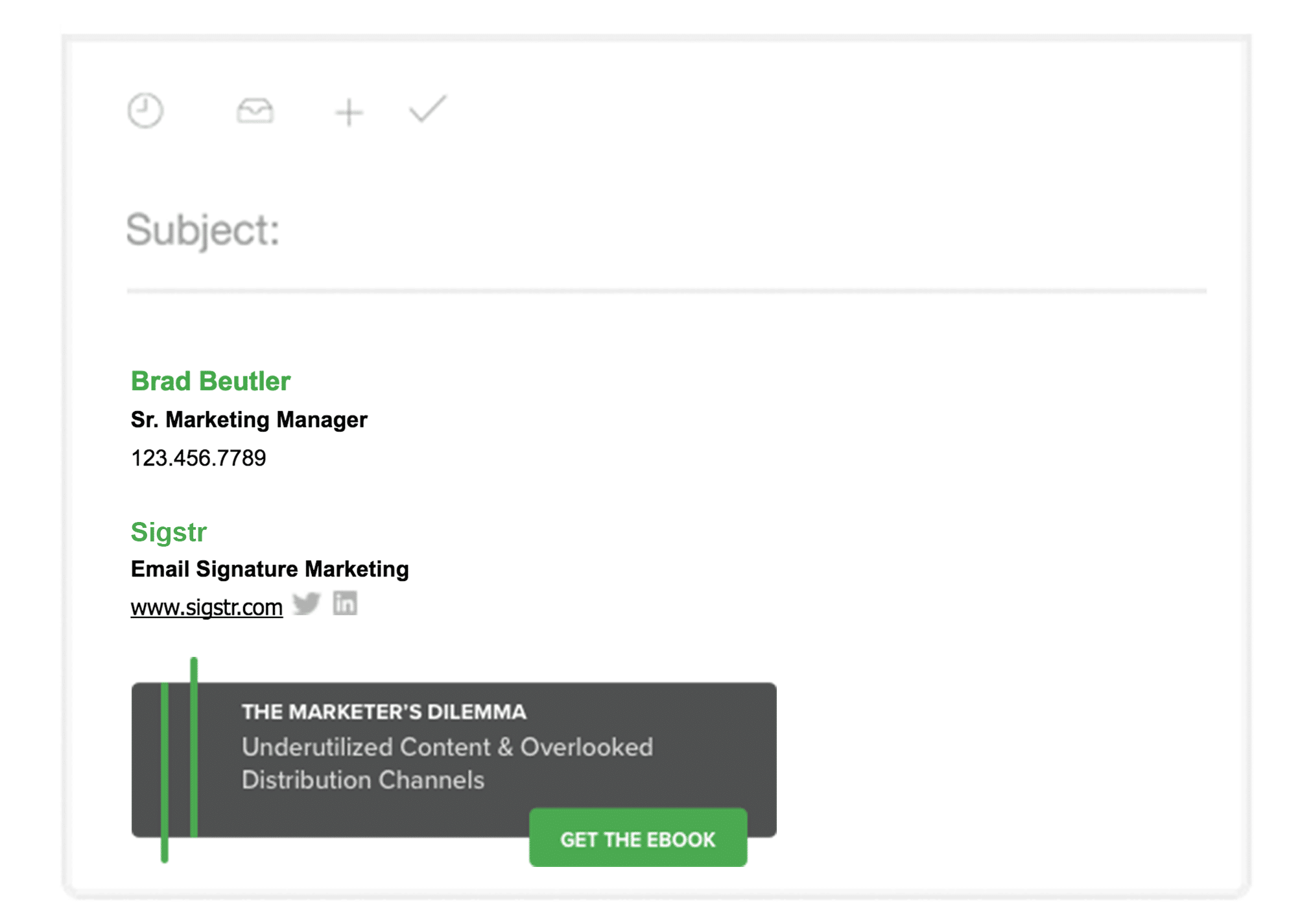
At Sigstr, we focus on unlocking employee email as a new owned marketing channel. Sigstr Campaign banners, placed within the employee email signature, allow you to put your content in front of your daily email contacts and bring attention to relevant resources, events or efforts.
Our primary focus is on our customers, and helping them create the best email signatures possible. This includes designing Campaign banners both internally and through our Services offerings. With that said, we thought we’d share a few insights after A/B testing some of our own Campaign designs.
Promoting a Case Study
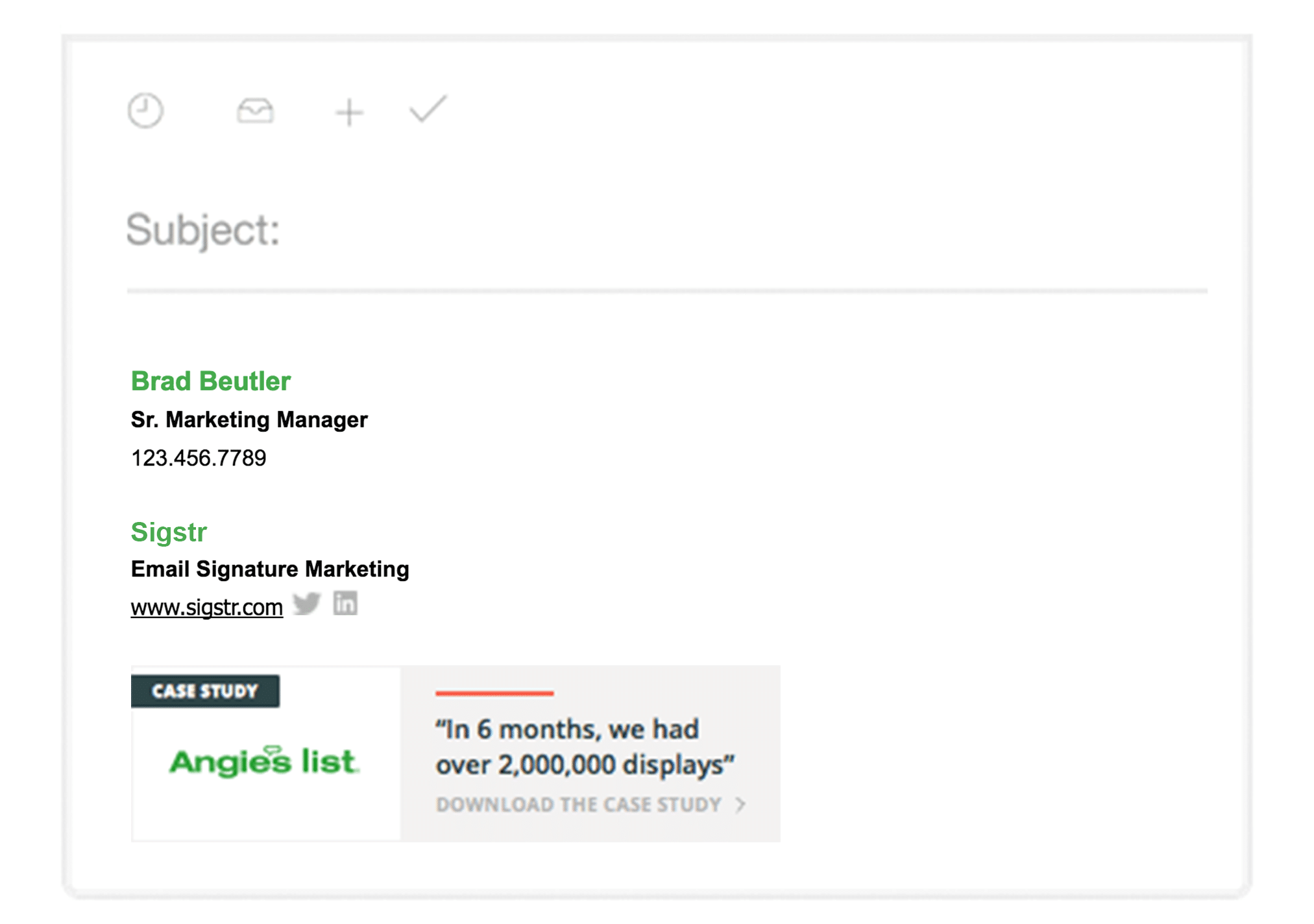
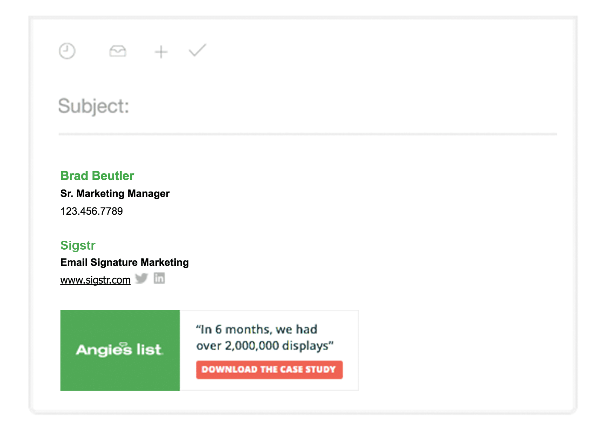
First, we wanted to test two different variations of a Campaign banner, each promoting the exact same resource (for this we chose the Angie’s List case study). Although the 2nd Campaign was live for a longer period of time, we found that more color with a clear call-to-action (in a bold color) performed better overall.
CAMPAIGN BANNER #1
Views: 4,987
Clicks: 19
Click rate: 0.38%
CAMPAIGN BANNER #2
Views: 14,179
Clicks: 74
Click rate: 0.52%
CTA’s and Picking the Right Color
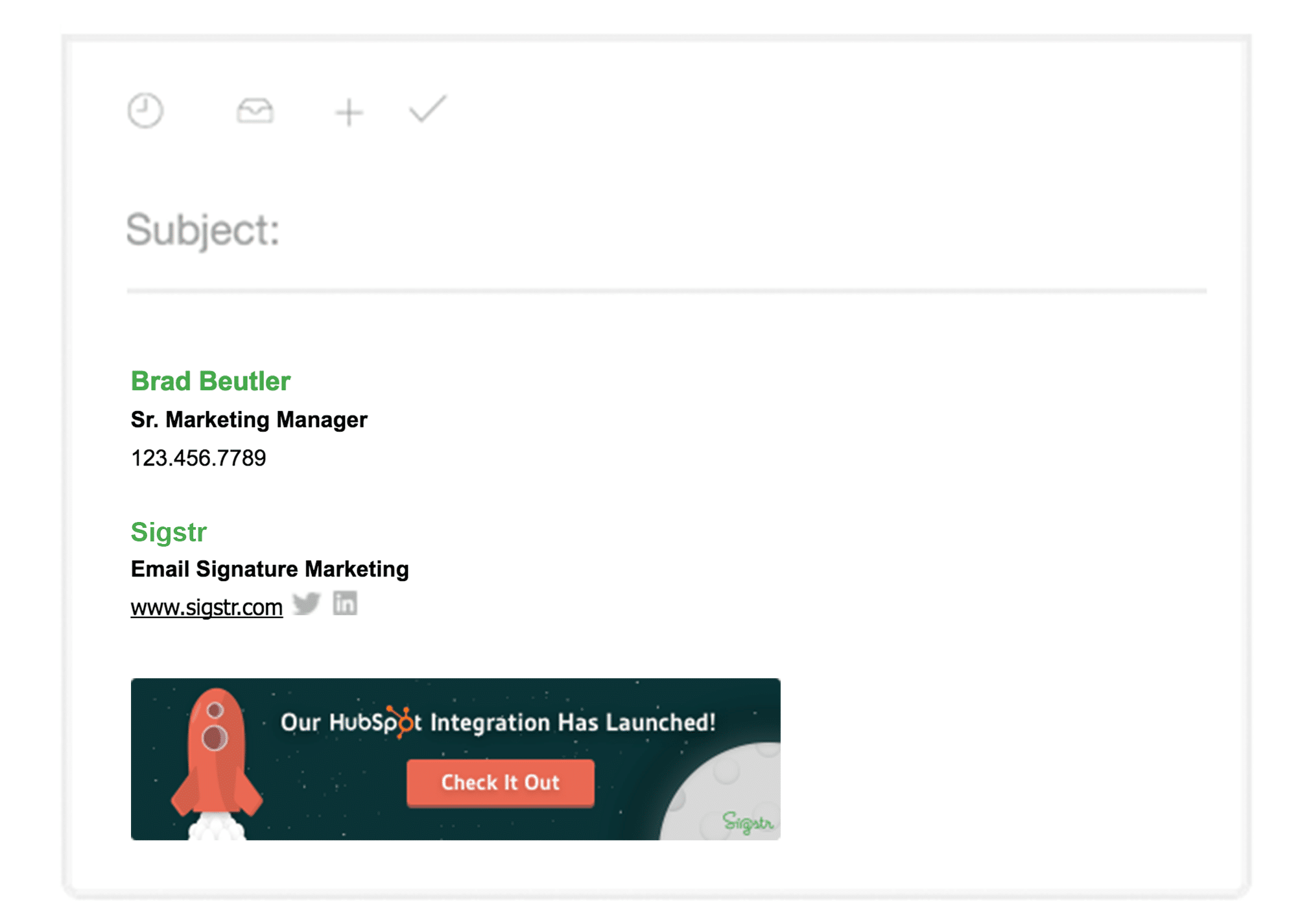
We recommend your Campaign design include a clear call-to-action with a bold or bright color. A part of the Sigstr brand color palette, peach and green are a few of our favorite colors to use for CTA’s. Here is how each color performed:
PEACH
Views: 29,175
Clicks: 295
Click rate: 1.01%
Views: 13,872
Clicks: 72
Click rate: 0.52%
GREEN
Views: 13,221
Clicks: 44
Click rate: 0.33%
Views: 6,809
Clicks: 31
Click rate: 0.45%
A Few More Best Practices
File Type: PNG files are recommended.
Size: We suggest an image size of 295-450 pixels wide x 60-100 pixels tall. Sigstr accepts images up to 600 pixels wide, but a mobile optimized version will be shrunk to 295 pixels.
Preview: In the Sigstr app, be sure to toggle between the mobile and desktop previews of your campaign. The previews are located on the right half of the “Add Campaign” screen.
Resolution: Until Sigstr supports high resolution displays, please upload images at 72 dpi.
Strategy:
- Use a call-to-action
- Help the customer first (think product guides, tips, tricks or release notes)
- Test, test and test again
- The best email signature design includes eye-catching images
- Get the word out (promote your newest ebook, case study or video)
- Keep it fresh (we switch out our Campaigns once a week)
- Divide and conquer (assign different Campaigns to different groups)
We Want to Hear Your Feedback
What works best for you and your company’s email signatures? How do your metrics compare? Does your company have the best email signature design? We’d love to hear more about how your team is using employee email to distribute your content and promote important company initiatives. Tweet @SigstrApp and show us your Campaign banner designs!
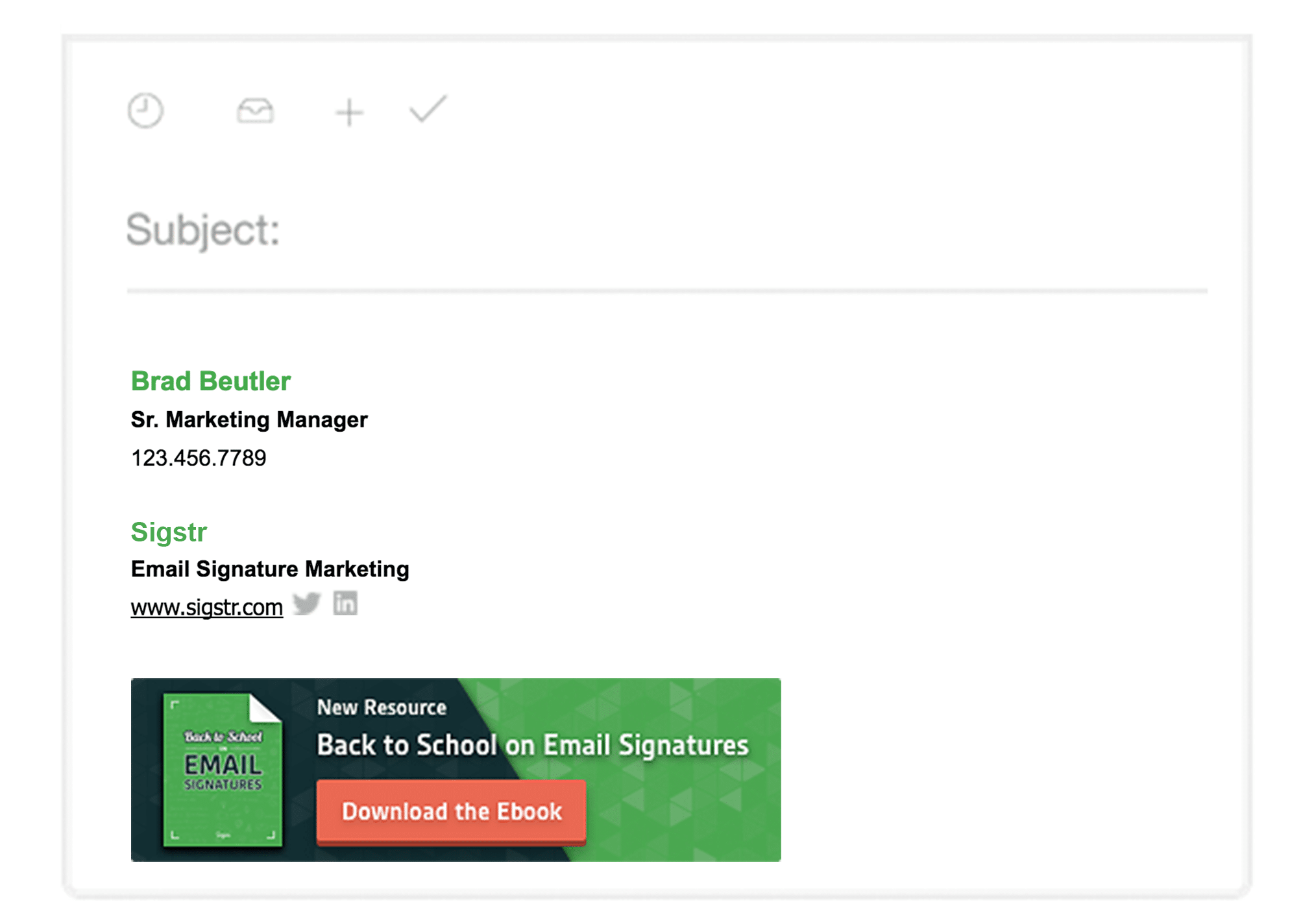
For more on Sigstr, check out our latest resource below:
