The number of email communications sent and received per day total over 269 billion, according to The Radicati Group Email Statistics Report. And on average, each of your employees will send or receive 122 emails per day. These are both eye-opening statistics, and make a case that no other marketing channels are as effective and efficient as employee email.
But how can you take advantage of this channel in a way that drives more conversions and distributes more content for your team? Now, with eye-movement technology and analysis, there is evidence that shows the most impactful part of these email communications. The email signature.
Exactly how does the employee email signature get noticed during these interactions? Do your contacts even pay attention to it? And if they do, is there a way to actually have it work in your favor?
To answer these questions and more, Sigstr teamed up with EyeQuant, an artificial intelligence platform that helps UX, CRO, and marketing teams make faster and better design decisions. EyeQuant’s design analysis technology instantly predicts how users are going to perceive any design. The predictions achieve between 85% and 90% accuracy when compared to large-scale human studies. Analysis includes a number of different tests, including the attention map, which shows which elements capture the most attention.
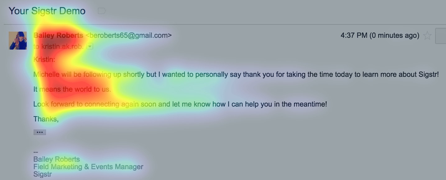
Test #1: Email with a non-branded email signature
First, we started with an email that includes a non-branded email signature. Standard in length, and with the typical information you would find in a traditional email signature. The recipient is naturally attracted to the sender of the email and body text. There is some acknowledgement of the email signature, but other than that, the reader pretty much ignores it.
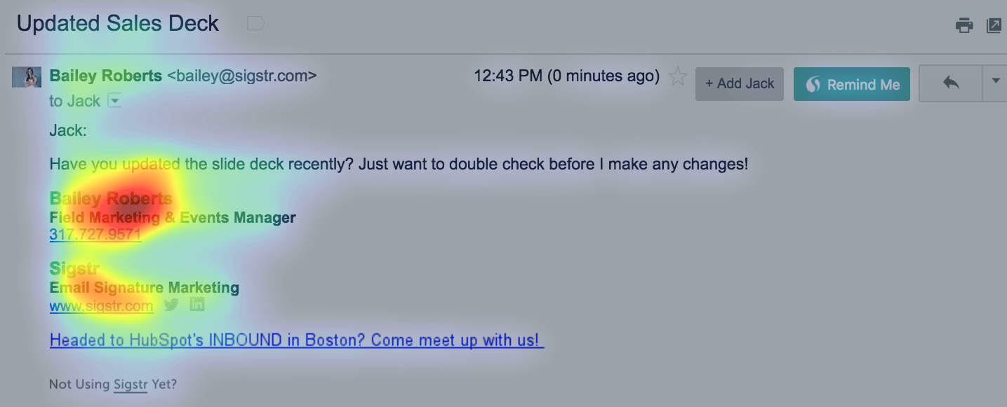
Test #2: Email with a branded email signature and text call-to-action
So what happens when a few simple elements are added? Just by bolding the font and adding some color, the recipient not only notices the email signature, they also engage and spend the majority of their time in that area. However, they hardly acknowledge the text call-to-action.
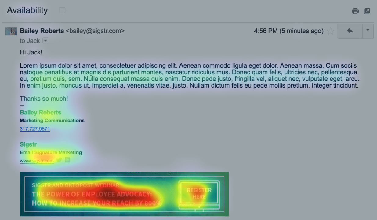
Test #3: Email with a branded email signature and banner call-to-action
Including a call-to-action that is more eye-catching and visually appealing makes a big difference. Not only did the recipient engage with the email signature in the example below, the attention map shows that they also focused heavily on the headline of the webinar banner and “register here” call-to-action.
Email is still the workhorse of digital marketing. Your most important contacts are engaging with employee email communications every single day and paying attention to their email signature. This piece of digital real estate is an extension of your brand – so use it to your advantage to drive conversions and distribute relevant content.
Ready to see all of the tests and learn more best practices around email signature marketing? Sigstr and EyeQuant’s new ebook includes 10+ tests with analysis on how prospects and customers interact with everyday email. Not only that, the ebook also shares what’s most effective within an email signature banner design (dimensions, color, layout, etc.). Download the “Science of Email Signatures” ebook today to see more.


