100 Banner Ads Examples + Terminus Ad Experiences Overview
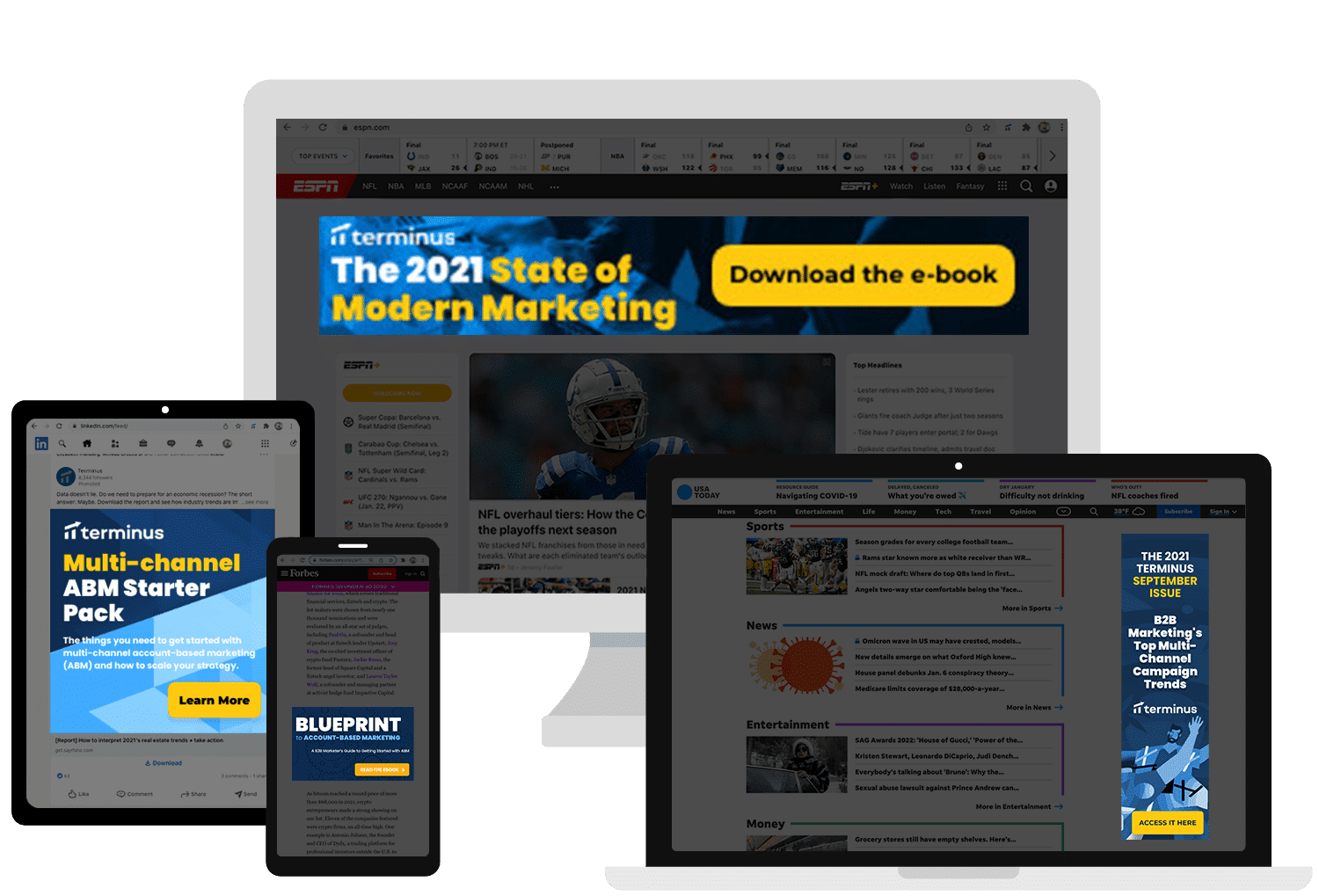
With Terminus Ad Experiences, teams can provide personalized advertising experiences that drive conversions with the right individuals at the right accounts. Learn more by watching the video overview, requesting a video, or accessing 90+ banner ads examples below.

Create an Unforgettable Ad Experience
Curate impactful buyer experiences with coordinated, personalized, and scalable multi-channel campaigns with Terminus. In the new work-from-home world, we are the best option for helping you reach your audience.

Understanding Targeted Display Advertising for B2B
Read the ebook
New ROI Study: The Total Economic Impact™ of the Terminus ABM Platform
Access it here
90 More Banner Ads Examples (The Best of Email)
Check 'em out hereBanner Ads Examples
Banner ads. They’re a fact of life. Banner ads show up across many digital channels: web, social media, email signatures, and more. In the old days of the web, banner ads were so plentiful they became problematic. Scarcely a page could be opened without dozens of bright, flashing advertisements. Today, banner ads are more subdued, and more directed at giving the consumer an interesting experience.
B2B marketing teams use banner ads today to get the right message in front of their most important audiences. Banner ads are no longer simply thrown up on random websites: they are part of extensive third-party networks that track individuals based on their habits and demographics.
But before a marketing team or design team chooses to jump into the execution phase of their digital banner strategy, they should look at as many banner ads examples as they can. What are the best banner ads? The worst ones? Which are used for which industries and which company products? This allows the team to use banner ads the way that they need to use them: in a targeted, controlled, and strategic environment.
Banner ad ideas begin with both the company’s brand and the product or service being sold. A product banner design is going to be different depending on the audience of the product. Bad banner ads are generic, flashy, and lack substance. Good, dynamic banner ad examples get to the point quickly and are highly targeted for their audience. Funny banner ads are also included in mobile banner ads best practices today: They tend to be saved and shared if they’re funny enough, and they almost always catch attention.
Apart from regular banner ad examples, PDF resources like Sigstr’s September Issue can help. But digital banner ad samples also need to be considered in terms of time. Banner ads change quickly. The best banner ads 2019 may not be the best banner ads for 2020, and the banner ad best practices 2019 may have likewise evolved.
Mobile banner ad examples are changing with some frequency as the way people use their mobile devices is changing, and online ads examples are always reinforced by the industry and the direction of the advertising campaign. Because responsive display ads best practices are always changing, and the banner ads that convert are changing with it, companies have to look up brand new banner content ideas while also considering realistic issues such as banner ad accessibility.
Google Ads
Google Ads is the largest ad network in the world. Through Google Ads, you can create a single ad or a group of ads, and distribute it across their widespread network. Their network consists of other, third-party sites that your product and service can be displayed on. Your product or service will be displayed to users who are most likely to be interested in your product or service. Ads powered by Google complement an overall digital advertising strategy, along with email ads, social media ads, and more.
The most important component of Google display ads value proposition is targeting. Through Google, you can target highly specific demographics, including look-a-like audiences with consumers that have already made purchases through your site. Google banner examples are also extremely varied. You can have text-only ads, image ads, and even video ads. These video ads can be posted in a variety of formats and set to display on mobile, desktop, or both.
Google Ads gives you extremely granular control over your advertising options. But it isn’t the only ad platform out there, either. It’s also followed by Bing, which advertises similarly, but has its own entire advertising network. Depending on your company, you may find that one works better than the other.
But Google Ads alone isn’t an advertising campaign. Ads have to be integrated into a more comprehensive solution. Strategies have to be used to integrate social media, websites, and more with advertising strategies. Altogether, this creates a more holistic advertising experience that builds on itself, creating more engagement with customers, and enforcing brand identity.
To get started on Google, Ads, companies should first assess their audience and their brand. They should then identify the keywords that are most likely to be used by those who are interested in your products and your services.
Banner Ad Design
Before discussing strategy, teams should look into what really makes a banner ad design. Why is the “best banner design” the best? What are general banner ad design best practices? First, you can look to banner design ideas examples. There are many pages of banner design ideas for school that outline the basic ad design principles:
- Eye-catching, but not too loud. Bright colors are good, but they shouldn’t clash. The eye should feel relaxed when looking at a banner ad, and shouldn’t have to strain to read any of the text. Bright flashing colors and particularly fast animations are now considered to be defunct. While in the early days of the web they could be quite dramatic, today they are considered to be gauche.
- Clear and concise. Banner ads should have a clear message with the right amount of text. It shouldn’t have so little text that it leaves individuals wondering what the company, product, or service is, but it also shouldn’t require a lot of reading. A single headline with a tagline, like a movie poster, is usually the most effective. Leave them wanting more.
- Photography and illustrations. Complex images often do well, especially images that involve a person. People scan for other people in media, it’s a known fact; that’s why ads usually include a person. There are many websites where you can get royalty free stock images. You can also purchase illustrations if you want your message to be a little more “on brand.”
- Call to action. What should they do next? Should they click the ad? Go to the website? Join a social media page? Should they call a number? The audience absolutely has to know what to do next once they’ve read the ad, or they’re simply going to disregard it even if they were initially interested in the premise.
Many of these follow general digital creative best practices. They need to be engaging but not too showy. They need to be accessible. Flex banner design ideas, MPU examples, and promo banner examples are all “offline” examples that carry the same design principles to online advertising. Promotion banner ideas can give a team an excellent jumping off point, as can the top performing display ad designs.
HTML5 Ads
HTML5 ads are a great way to build both static and animated banner ads. Take a look at animated banner ads examples and old school flash ads examples, and you can probably do that with HTML ads and HTML banner ads. There are websites where you can create HTML5 banner ad templates free and static ads examples. You can also look at animated banner ads best practices for more information.
What are the advantages of HTML5 ads rather than flash banner examples? First, animated banners are more effective than static banners, but they still need to be viewable on any device. An HTML5 video ads example will run on anything, but flash banner examples are considered to be outdated and have security risks on many devices. HTML5 video banner ads are also much smaller than video banner ad examples that use something like a GIF. So, HTML5 banner ads will also be downloaded faster and more likely to be viewed.
Regardless, design teams need to be cautious when creating banner ads that move. If they’re too fast, they can leave the audience overwhelmed, or simply leave a bad brand impression. These types of banners can also take more time for a design team to make, which is why static banners are more common. But even static banners can be eye-catching without dramatic or subtle movement.
Not every banner ad should be animated and some types of ads lend themselves better to animation than others. While a fun app or game might need an animated banner, something more serious like real estate may not. It again depends on the audience for the banner ad, and research behind the ad. Sometimes, creating a static and an animated ad and then seeing which is most effective can help.
With advertising, it’s often best to try out different things, as it’s not always possible to immediately identify what will be successful or not. This is where data, such as from platforms like Google Ads, becomes important.
Web Banner Ads
Think about some of the web banner ads and web banner examples you have noticed on your favorite websites. You may go to a store that features crochet needles: Everywhere, the ads are likely to relate to yarn. Web banner advertising generally focuses on putting ads that are related to the site and the audience at the forefront, and there are many places they can put these ads. There are top banners, footer banners, and side banner ads, each with a different banner ads cost.
Creative web banners are targeted directly to audiences that are most likely to make purchases, and then they’re put on the websites that those audiences are likely to visit. This is why when you see ads, you’re often seeing them from companies you’ve interacted with in the past. Sometimes they’re even about purchases that you just made!
But with so many options out there, it can also be frustrating for new teams to figure out what type of banners they should run. Should they be static or dynamic? At the top or the side? Should they be large and small? Targeted more towards mobile, more towards desktop, or to both evenly?
That’s where Terminus comes in. Terminus can help advertising teams become more efficient through this type of advertising, by helping the organization with efficient account-based targeting. The more targeted you are, the less money you waste on unqualified leads clicking on your banners.
For most advertising companies, you only pay if someone clicks. From there, it’s your company’s responsibility to make sure that you’re able to funnel your leads towards a sale. If people are clicking who don’t understand what your company is or who aren’t likely to make a purchase, you won’t make a sale. But if the audiences that do click on your ad are highly interested and likely a good fit for your product or service, your return on investment with advertising improves dramatically.
- Display Ads
- Display Advertising
- Web Advertising
- Banner Ads
- Online Advertising
- Display Marketing
- Display Ads Example
- Online Advertising Costs
- Digital Display Ads
- Digital Display Advertising
- Display Ad Targeting
- Online Display Advertising
- Targeted Display Advertising
- Targeted Online Advertising
- B2B Advertising
- Digital Advertising Platforms
- Banner Ad Design
- Facebook Ads